
Poster designed for the Whiplash Dragon Boat team for their End of Season Celebration and Fundraiser.
“Keep Whipping” is the perfect tagline to represent the team’s enthusiasm for growth and challenge.
Poster designed for the Whiplash Dragon Boat team for their End of Season Celebration and Fundraiser.
“Keep Whipping” is the perfect tagline to represent the team’s enthusiasm for growth and challenge.
The Brief: Elegant and classy invitation.
Concept: Tiffany – diamonds, sparkles, clean, classy, and just because the bride LOVES her diamonds.

Envelopes

Envelope with rhinestone detailing

Cover with rhinestone buckle

Clean and simple invitation.

Inside with rhinestone detailing.

Directions & Reply

Placecards for guests – Each card was hand cut one by one. Yes, that was over 200 butterflies.
Lightlife Solutions provides their customers with the most efficient LED bulbs in the market. Their goal is to help consumers save energy cost and help the environment by lowering carbon emissions, as well as bringing safer technology into businesses and homes.
The Brief: To design a logo that represents LED lighting technology.
The Solution: A simple, clean and modern wordmark utilizing the image of a light bulb, paired with a custom typeface, and accompanied by fresh airy colours.
The Brief: Business cards need to convey the business at a glance.
The Solution: Keeping with the simplicity, clean and modern style, fresh crisp images of the products were included on the business cards.
The Production: Double-side 260g card stock with matt lamination, UV coating on the front, and custom diecut.

The Brief: Design a brochure that provides information to consumers about the company, products, and the benefits of switching to LED bulbs.
The Solution: Playing with the concept of enlightenment, contrast was used to highlight the products offered, benefits to switch, and company information. Font size were kept large for legibility reasons.
The Production: Double-side 128g gloss art paper due to budget restrictions. Ideally it would have been on card stock with matt lamination, just like the business cards.

The Brief: Design a catalog that provides more details and specifications about the product. It is designed for distributors and contractors that care about the specs of the LED bulbs.
The Solution: Kept it simple. Used images that support LED light bulb applications.
No Equivalent Art (NEA) believes that digital photography should be as valuable as original art and never be replicated. Original art does not have copies, neither physical nor digital.
NEA’s ideal is expressed through the identity with dots of a rosette pattern, which resembles a flower. The type was customized to illustrate its uniqueness.
In support of our Calgary office, I have designed a t-shirt for those supported the Revay team as a token of appreciation. Unfortunately, it didn’t make it into full production as anticipated.

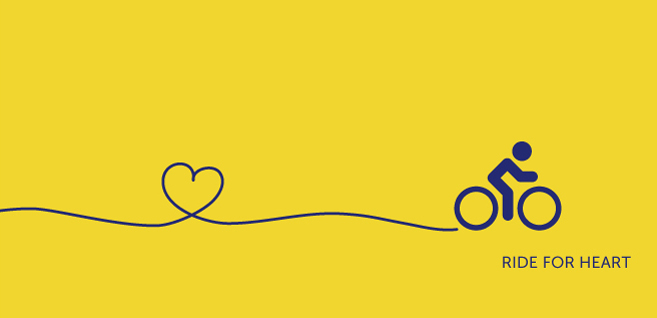
Inspiration: The individual’s path in life that one sets for themselves through their heart… or in this case, for their heart and health

Inspiration: A simplified scenic landscape of Calgary… I think I would have a tough time keeping my eyes on the road.

Inspiration: The actual riding path
The Brief: DJ Knocturnal (a.k.a. Norman) needed a simple website to promote his DJ services for weddings and corporate events. His only request was to include a space to commemorate his friend Ming.
The Solution: Designed a WordPress template for him to post his music and blogs. A ‘Memory’ page was created in the style of a photo gallery slideshow, which allows the user to add photos of any size and orientation.
URL: www.djknocturnal.com
![]()
An identity designed for DJ Knocturnal’s website. Notice the heart in the ligature? Norman is very passionate about music.
Revay and Associates has specific requirements for the website. They want to take totally different direction, from flash based website to pure HTML, with strong emphasis on their consultants and projects.
The website was revitalized by introducing more colours, adding project profiles, improving the user experience, and it is now search engine friendly.
URL: www.revay.com


Goal: Redesign and update the logo for the Ontario Building Envelope Council.
![]()
Solution: Geometric typeface playing with the symmetry of the characters. The trillium flower is embedded to represent the province of Ontario. Earth tone colours are used to represent natural elements that building envelopes come in contact with.
![]()
Solution: Geometric typeface playing with the symmetry of the characters. The trillium flower is embedded to represent the province of Ontario. Earth tone colours are used to represent natural elements that building envelopes come in contact with.

This layout is asymmetrical and modern.

The layout is symmetrical and traditional.
Design and develop OurBackyard.ca website with an online shopping cart to bring safe and environmentally friendly products to health conscious individuals.
Brown Bird Consulting is a marketing service geared towards the natural and organic retail industry. The identity was designed for the ethical, health conscious individuals and businesses alike. It represents the consultant as an individual that is contemporary, fresh and unique. Much like its audience, the graphic style is very organic and clean.